Finding inspiration in the streets that brought this brewery to life.
Client
UES Brew Haus
Objective
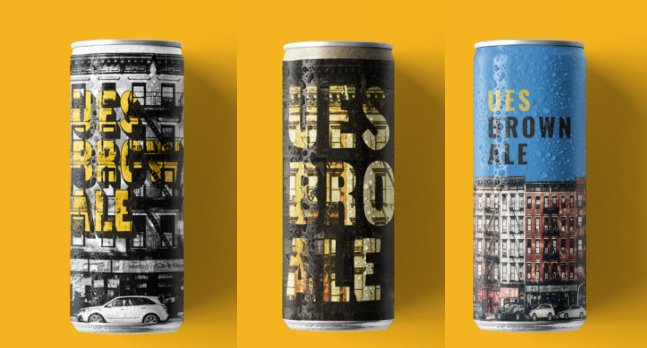
Create a set of 16 oz. can designs
for a new beer. Use elements from
the area and company colors in the
composition.
The Upper East Side is full of character unique to the area that I wanted to incorporate into the design. I wanted to play with color to reach the text forward without being too in your face. On this first attempt I washed the scene with a horizontally stratified color palette then burnt the text in.
At this point the text would be visible on a poster for instance but would be much harder to read on a can. My solution was to invert the scheme so that the text lay lighter on the background which would allow the details underneath the text to show without making it illegible. I made the choice to not fully remove the color beneath the text so the red shows through slightly.

I was pleased with this design but wanted to continue exploring to see what else I could come up with.They got along quite well at first, but when they reached the middle of the river the swift current swept the raft downstream, farther and farther away from the road of yellow brick. And the water grew so deep that the long poles would not touch the bottom.
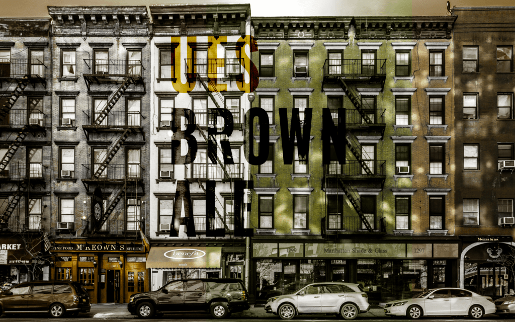
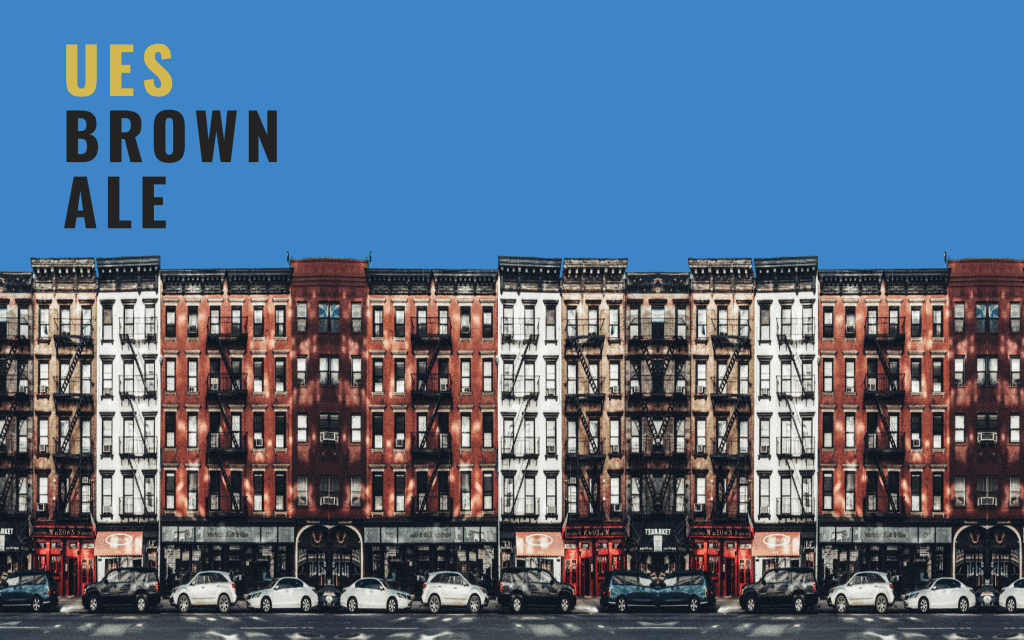
From here, I was thinking about returning to a full color design which would show off the beautiful brownstone colors contrasted against the blue sky. I chose a blocky font that would distance itself from the design and yet had a similar industrial feel.
That design, while interesting didn’t seem to be cohesive, so I tried integrating the text into the design.
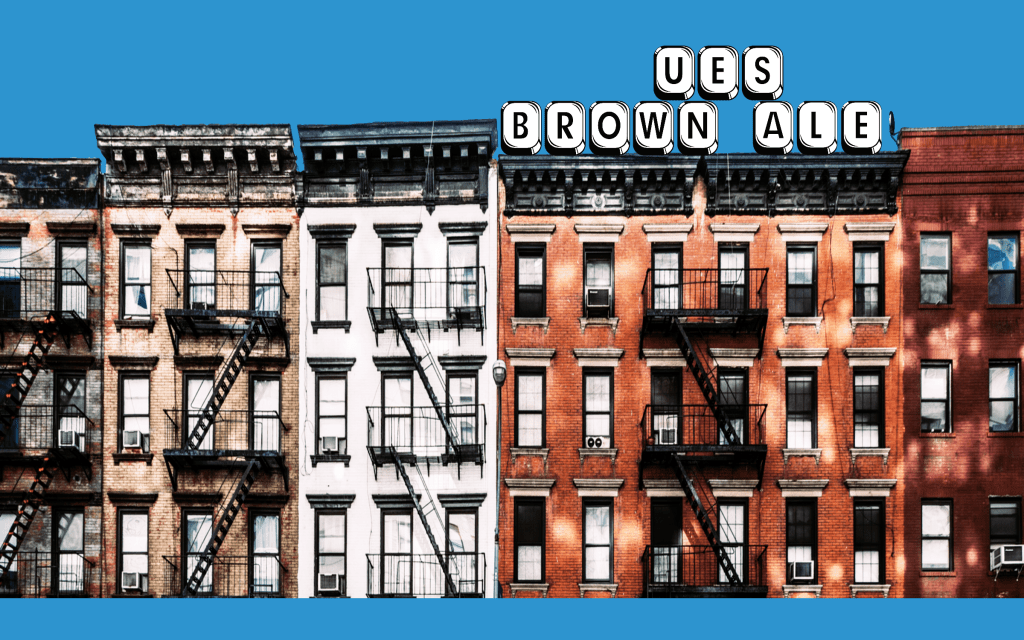
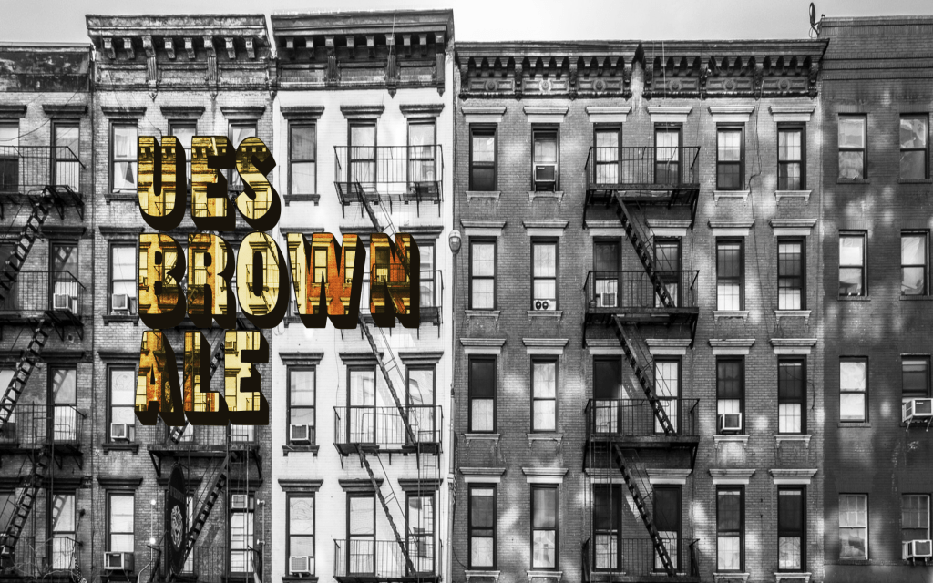
It was at this point I realized the font I was using was incredibly similar to that of Waffle House so I promptly got rid of it and tried another font. Moving things around, I tried to open up the space and draw more attention to the streetscape by utilizing the negative space.

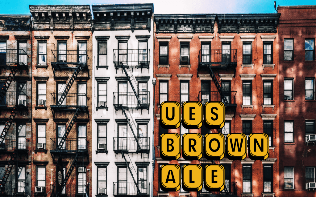
While it didn’t look great as a flat design, it was quite effective when modeled on the can. I made another adjustment to try and achieve both and make the can more interesting if you have it on a table and are rotating it around.
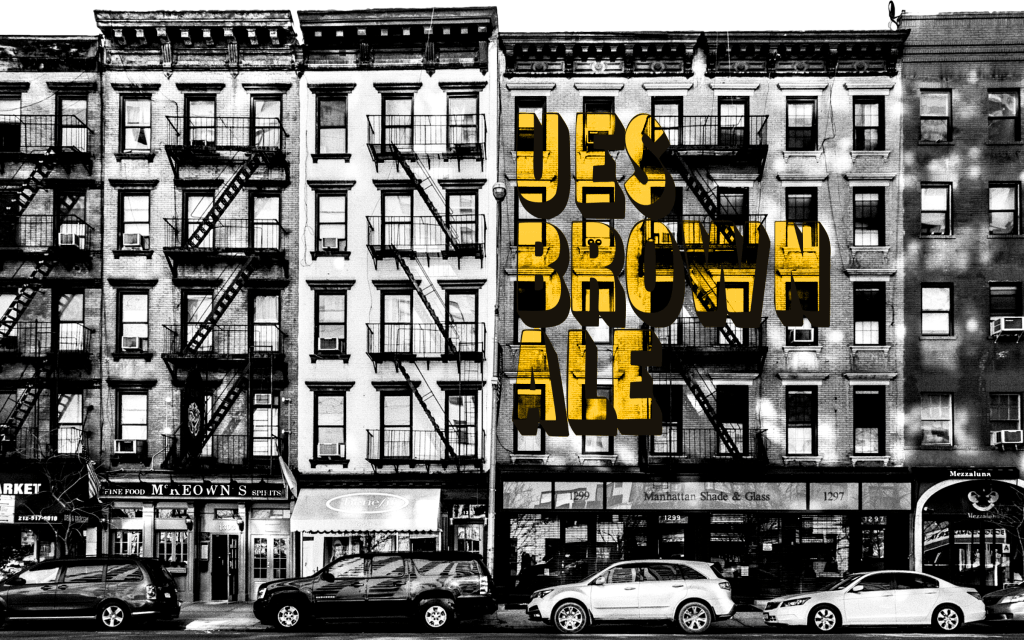
This one seemed cool. The effect I was looking for worked. After this, I wanted to return to my original design, this time with a little more insight. By dropping the shadows and raising the highlights, I got rid of the midtones which seemed to muddy the original design. I then overlayed the text several times to achieve the correct color/luminosity balance. The end result is a strong design that pops while still adhering to the stylistic vision.


Copyright © 2023 CrazyWonton
